Canvas App: Gallery Search Using the ‘DelayOutput’ Text Property
Discover in this article how you can improve gallery item searches by leveraging the DelayOutput text property.
What is DelayOutput property:
- When set to true, user input is registered after half a second delay.
- Useful for delaying expensive operations until user completes inputting text (i.e. for filtering when input is used in other formulas).
Let’s explore the benefits of the DelayOutput property with an example. I’ve created a simple app featuring a gallery and a textbox with a search function utilizing the Search function.

Below is the formula for the Search function that I have in the Items property of my Gallery.
Search(
    Employees,
    txtSearchEmployees.Text,
    Name,
    City,
    Company
)
If you observed the search behavior above closely, you’ll notice that the search was triggered with every keypress in the textbox.
While this is acceptable, what if you prefer to delay the search until the user stops typing, rather than triggering it with every keypress?
Here comes the DelayOutput property of Text Input control.

By default, the DelayOutput value is false, causing the search to occur with each key press.
Let’s set the DelayOutput value to true and test the search functionality. You’ll notice that the search occurs after you stop typing.

I hope this explanation helps you understand how to use the DelayOutput property.
🙂
Dataverse | Restore deleted table records (preview)
As part of the preview feature, the Recycle bin kind of option is available under Data Management to recover table record data from any type of delete scenario within a specified configurable time frame.
To use this feature, it must be enabled in the environment where you want to restore Dataverse table records.
Enable restore table records in an Environment:
- Sign in to the Power Platform admin center as an admin (Dynamics 365 admin, Global admin, or Microsoft Power Platform admin).
- Select Environments and open the environment you want.
- Select Settings > Product > Features.
- Scroll down to view the Recycle Bin settings.
- Turn On the Recycle Bin setting.
- Specify the time interval, to be able to restore table records. You can restore table records up to 30 days after the record was deleted.
View and restore the deleted records in Power Apps:
- Sign in to the Power Platform admin center as a user with the system administrator security role.
- Select Environments and open the environment you want to view and restore deleted records.
- Go to Settings > Data management > View Deleted Records.

- You can view all the deleted records from all tables in a new tab.
- Select one or more records you wish to restore, and then select Restore on the command bar.

Known issues
Some records aren’t restored
- Some organizations add custom business logic that deletes records related to a record that is deleted.
- To restore related records deleted by custom business logic, you need to apply the opposite logic on the
Restoreoperation to recover the records when you restore the original record that was deleted. - However, Records deleted via the table relationship cascade behavior process can be restored.
Refer this link for more details.
🙂
Power Platform | Tenant-level analytics
Lets say you are a Power Platform Administrator and you would like to know about
- How many apps exist in my tenant or environment?
- Which of my environments had the most unique users?
- What were the top apps by unique users/app sessions?
- How many flows exist in my tenant or environment?
- What is the count of Successful vs Failed runs across Cloud flows?
Did you know that Tenant-level analytics allows admins to view and compare insights derived from the Platform telemetry data across environments they manage.
Tenant admins can view reports containing analytics that apply to all environments within the tenant.
Enabling Tenant-level analytics :
A member of one of the following admin roles is required to enable tenant-level analytics:
- Power Platform admin
- Microsoft 365 Global admin
- Delegated admin
To enable the feature using the following steps:
- Sign in to the Power Platform admin center and select Analytics > Power Apps or Analytics > Power Automate.
- Select the Overview tab.
- Select Enable to redirect to the Analytics pane.

- In the Analytics pane, grant consent for tenant-level analytics by enabling the Tenant-level analytics feature.

- The Overview tab displays a message indicating that tenant-level analytics has been enabled. Typically, these reports are displayed within 24-48 hours of enabling the feature.

The service only starts collecting the data visualized in the Usage report when the Tenant-level analytics feature is enabled. It can take 24 to 36 hours to reflect service activities from the previous day.
Lets understand what kind of analytics are available for both Power Apps and Power Automate.
Tenant-level analytics for Power Apps:
Power Apps reports provide insights into tenant and environment usage and inventory of all apps and connectors. The report answers questions such as:
- What is the count of unique canvas/model-driven apps users across the tenant or environments?
- What is the count of first-time users across canvas and model-driven apps?
- How many apps exist in my tenant or environment?
- Which of my environments had the most unique users?
- What were the top apps by unique users/app sessions?
Refer this link for more details.
Tenant-level analytics for Power Automate:
Power Automate reports provide insights into tenant and environment usage and inventory of all flows and connectors. The report answers questions such as:
- What is the total count of active Cloud flows across the tenant or environments?
- What is the count of Successful vs Failed runs across Cloud flows?
- How many flows exist in my tenant or environment?
- Which of my environments had the most unique users?
- What were the top flows across my tenant or environments by runs?
Refer this link for more details.
🙂
Canvas App | Multiple Combo box filters on Collection
In this article, let’s see how to achieve complex multi-combo box filters on collections. Here is what the app with filters looks like:

Let’s first understand our scenario and then proceed with building the app.
Scenario:
- I have the ‘Customers’ collection as defined below.
- Collection has ‘Status’ and ‘Fav Sports’ attributes
- ‘Status’ holds a single value (i.e., Active or Inactive)
- ‘Fav Sports’ holds comma-separated values.
- Collection has ‘Status’ and ‘Fav Sports’ attributes
ClearCollect(
    Customers,
    {
        Name: "Rajeev",
        Status: "Active",
        'Fav Sports': "Cricket"
    },
    {
        Name: "Jayansh",
        Status: "Inactive",
        'Fav Sports': "Cricket,TT"
    },
    {
        Name: "Mahesh",
        Status: "Active",
        'Fav Sports': "TT,Chess"
    },
    {
        Name: "Havish",
        Status: "Inactive",
        'Fav Sports': "TT"
    }
);- Build an App with two combo boxes for both ‘Status’ and ‘Fav Sports’.
- Add a Gallery and load the ‘Customers’ collection.
- Filter the Gallery records using the selected values from the ‘Status’ and ‘Fav Sports’ combo boxes.
As we know the scenario now, let’s build the App.
Building the App:
- Create a new Canvas App and on App > Start define the ‘Customers’ collection.

- Add a Gallery and set Items as ‘Customers’ collection.

- Add two combo box controls for ‘Status’ and ‘Fav Sports’, as shown below. We’ll primarily set the Items and NoSelectionText properties.
- NoSelectionText property sets ‘All’ as the text when no item is selected in the combo box.

Now that we’ve added the required controls to the screen, let’s proceed with the filter logic.
Build ‘Status’ combo box filter:
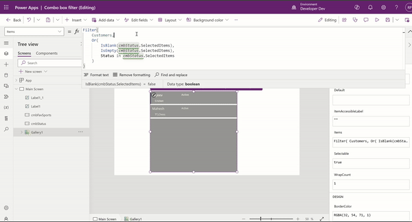
- To build the filter logic for the ‘Status’ combo box, place the following formula in the Items property of the Gallery, and then play the app.
- Following is the formula explanation:
- If no items are selected, the cmbStatus ‘SelectedItems’ property will be blank, and IsBlank() or IsEmpty() will return true, hence all records will be shown.
- If items are selected in cmbStatus, we use the ‘in’ operator to fetch only the matched records by the ‘Status’ field.
Filter(
    Customers,
    Or(
        IsBlank(cmbStatus.SelectedItems),
        IsEmpty(cmbStatus.SelectedItems),
        Status in cmbStatus.SelectedItems
    )
)
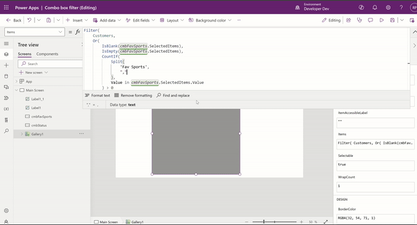
Build ‘Fav Sports’ combo box filter:
- Now, this is the tricky part of the filter, as we have to match the cmbFavSports combo box values to the comma-separated ‘Fav Sports’ text field.
- To build the filter logic for the cmbFavSports combo box, place this formula in the Items property of the Gallery, and then play the app.
- Note : We are removing the cmbStatus filter for now to explain the cmbFavSports filter. Towards the end, we will combine both combo box filters into one filter formula.
- Following is the formula explanation:
- If no items are selected, the cmbFavSports ‘SelectedItems’ property will be blank, and IsBlank() or IsEmpty() will return true, hence all records will be shown.
- If items are selected, we split and count how many favorite sports of each customer match the selected items in the cmbFavSports , ensuring that only customers with at least one matching sport are included in the filter.
Filter(
    Customers,
    Or(
        IsBlank(cmbFavSports.SelectedItems),
        IsEmpty(cmbFavSports.SelectedItems),
        CountIf(
            Split(
                'Fav Sports',
                ","
            ),
            Value in cmbFavSports.SelectedItems.Value
        ) > 0
    )
)
Build ‘Status’ and ‘Fav Sports’ combo box filters together:
Lets get both filters get working in one formula.
- To build the combined filter logic for cmbStatus and cmbFavSports combo boxes, place the following combined filter formula in the Items property of the Gallery, and then play the app..
Filter(
    Customers,
    Or(
        IsBlank(cmbStatus.SelectedItems),
        IsEmpty(cmbStatus.SelectedItems),
        Status in cmbStatus.SelectedItems
    ) &&
    Or(
        IsBlank(cmbFavSports.SelectedItems),
        IsEmpty(cmbFavSports.SelectedItems),
        CountIf(
            Split(
                'Fav Sports',
                ","
            ),
            Value in cmbFavSports.SelectedItems.Value
        ) > 0
    )
)
That’s it! We have achieved multi-combo box filter logic. I hope you learned how to apply multi-combo box filters on a collection.
🙂
FetchXML : Filter on column values in the same row
Did you know that by using the valueof attribute, you can create filters that compare columns on values in the same row.
Scenario 1 : Find Contact records where the firstname column value matches the lastname column value
- The following FetchXML has valueof attribute, which matches firstname with value of lastname and returns matching Contact records.
<fetch>
   <entity name='contact' >
      <attribute name='firstname' />
      <filter>
         <condition attribute='firstname'
            operator='eq'
            valueof='lastname' />
      </filter>
   </entity>
</fetch>
Scenario 2 : Cross table comparisons – Fetch rows where the contact fullname column matches the account name column
- In the below FetchXML, we are using valueof and link-entity to compare column values across the tables Contact and Account.
- Please note that, the link-entity element must use an
aliasattribute and the value of thevalueofparameter must reference that alias and the column name in the related table.
<fetch>
   <entity name='contact'>
      <attribute name='contactid' />
      <attribute name='fullname' />
      <filter type='and'>
         <condition attribute='fullname'
            operator='eq'
            valueof='acct.name' />
      </filter>
      <link-entity name='account'
         from='accountid'
         to='parentcustomerid'
         link-type='outer'
         alias='acct'>
         <attribute name='name' />
      </link-entity>
   </entity>
</fetch>
Please refer my past articles or Microsoft Docs on how to execute the FetchXML.
🙂
GitHub : Export issues to a CSV file
In this article, let’s see how to export GitHub issues to a CSV file using the Git CLI.
The steps I am going to show you are tailored for a Windows machine, but the steps for non-Windows machines are mostly the same. I will also share the official documentation link in case you encounter any issues.
Lets get started with the steps.
Install the GitHub CLI:
- Refer to this documentation for steps to install CLI on various OS. Since I’m using Windows OS, if you’re a Windows user, follow along.
- Open the command prompt and execute following command:
winget install --id GitHub.cli
- Note : Make sure you close and open the terminal again. Simply opening a new tab will not be sufficient.
After installing the CLI, the next step is to complete authentication.
Authenticate with GitHub account:
- Execute the following command to start the authentication process.
gh auth login- Select the options and keep pressing Enter button.
- You will be presented with a one-time code.
- Press Enter again, which will open a browser window asking for the code.

- Enter the code copied from the command prompt, and then press Continue

- In the next screen, click on Authorize github

- You will be redirected to the following success screen.

- Go back to the command bar, and you will see the message as below.

Now that we have completed the authentication, we can proceed with exporting issues to CSV.
Export the issues to csv:
- Open the official documentation to understand the syntax of gh issue list command, where you can apply filters to narrow down the list.

- In my scenario, I want to export all the issues with the ‘Documentation’ label. Hence, I executed the following command:
gh issue list --label "documentation" -R <github_project-name> --limit 1000- Note : If you don’t provide –limit, by default you get only 30 items.
- The above command will fetch and display the list of issues within the command prompt, as shown below.

- To store the list in a CSV file, execute the following command:
gh issue list --label "documentation" -R microsoft/coe-starter-kit --limit 1000 > Documentation_Issues.csv
- A CSV file with the list of issues is generated in the command execution path.
Hope you understand the steps to download the issues using the GitHub CLI.
🙂
[Beginners] Power Fx: ShowColumns, AddColumns, RenameColumns and DropColumns
ShowColumns, AddColumns, RenameColumns and DropColumns are Power Fx functions which helps you to shape your collection. In this article, I will try to explain these functions with a simple scenario.
Scenario:
- Create a new Canvas App.
- Add a Dataverse Contact table as a Canvas App DataSource
- Read the Contact table to a Collection and by default, all the columns of the Contact table are added to the Collection.
- We will shape the collection to keep only the required columns.
- Add a new column ‘Fullname’ to the collection.
- Rename columns and remove unwanted columns.
Let’s get started and execute our scenario by building a simple Canvas App.
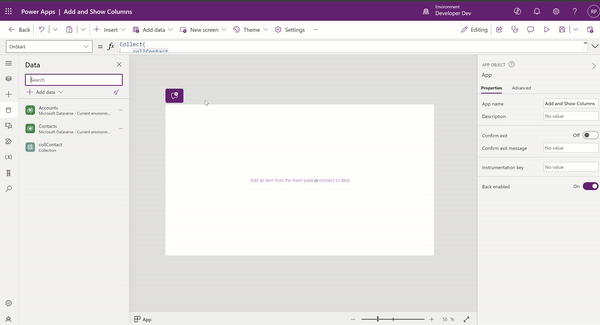
Steps to create the canvas App:
- Create a new Canvas App and add a Contact Dataverse table as Datasource.
- On App > OnStart write following formula to read the Contact table records in to a collection collContact.
Collect(
    collContact,
    Contacts
);- Execute the Run OnStart and check the collContact records, which contain all the columns of the Contact table.
- Let’s say we only need to add the following highlighted columns to the collContact collection. We can use the ShowColumns function.

Using ShowColumns function:
- The syntax of ShowColumns function is as follows:
ShowColumns( Table, ColumnName1 [, ColumnName2, ... ] )

- Table - Required. Table to operate on.
- ColumnName(s) - Required. Names of the columns to include.- Let’s see how we can achieve our requirement of adding only specific Contact table columns to the collContact collection.
- Add following formula in App > OnStart
Collect(
    collContact,
    ShowColumns(
        Contacts,
        'First Name',
        'Middle Name',
        'Last Name',
        Email,
        'Mobile Phone'
    )
);- Execute the Run OnStart, and check the collContact records.

- The collContact collection will only have the columns you want. That’s the use of the ShowColumns function.
Using AddColumns function:
- The collContact collection now shows the firstname, lastname and middlename columns as below.

- How about creating a new column ‘Fullname’ by joining firstname, lastname, and middlename columns? Let’s see how to achieve that using AddColumns.
- Following is the syntax of AddColumns.
AddColumns( Table, ColumnName1, Formula1 [, ColumnName2, Formula2, ... ] )

  - Table - Required. Table to operate on.
  - ColumnName(s) - Required. Names of the columns to add.
- Formula(s) - Required. Formulas to evaluate for each record. The result is added as the value of the corresponding new column. You can reference other columns of the table in this formula.- Let’s achieve our requirement by updating the previous formula with the following formula:
Collect(
    collContact,
    AddColumns(
        ShowColumns(
            Contacts,
            'First Name',
            'Middle Name',
            'Last Name',
            Email,
            'Mobile Phone'
        ),
        Fullname,
        firstname & " " & middlename & " " & lastname
    )
);- Execute the Run OnStart and check the collContact records. collContact collection will now have a new Fullname column.

Using RenameColumn function:
- If you notice, the column names of the collContact collection are not intuitive. Lets rename the columns using the RenameColumns function.

- Following is the syntax of RenameColumns function.
RenameColumns( Table, OldColumnName1, NewColumnName1 [, OldColumnName2, NewColumnName2, ... ] )

  - Table - Required. Table to operate on.
  - OldColumnName(s) - Required. Names of the columns to rename from the original table.
- NewColumnName(s) - Required. Replacement names. - Lets achieve our requirement by updating the previous formula with the following formula:
Collect(
    collContact,
    RenameColumns(
        AddColumns(
            ShowColumns(
                Contacts,
                'First Name',
                'Middle Name',
                'Last Name',
                Email,
                'Mobile Phone'
            ),
            Fullname,
            firstname & " " & middlename & " " & lastname
        ),
        emailaddress1,
        'Email Address',
        firstname,
        'First Name',
        middlename,
        'Middle Name',
        mobilephone,
        'Mobile Number'
    )
);- Execute the Run OnStart and check the collContact records. collContact collection will now have the new column names.

Using DropColumns function:
- The collContact collection looks as below after applying above formulas.

- How about removing ‘First Name’, ‘Middle Name and ‘lastname’ from the collContact collection, since we already have the ‘Fullname’ column? Let’s drop the columns using the DropColumns function.
- Following is the syntax of DropColumns:
DropColumns( Table, ColumnName1 [, ColumnName2, ... ] )

  - Table - Required. Table to operate on.
- ColumnName(s) - Required. Names of the columns to drop.- Lets achieve our requirement by updating formula as below:
Collect(
    collContact,
    DropColumns(
        RenameColumns(
            AddColumns(
                ShowColumns(
                    Contacts,
                    'First Name',
                    'Middle Name',
                    'Last Name',
                    Email,
                    'Mobile Phone'
                ),
                Fullname,
                firstname & " " & middlename & " " & lastname
            ),
            emailaddress1,
            'Email Address',
            firstname,
            'First Name',
            middlename,
            'Middle Name',
            mobilephone,
            'Mobile Number'
        ),
        'First Name',
        'Middle Name',
        lastname
    )
);- Execute the Run OnStart and check the collContact records. collContact collection will not have the ‘First Name’, ‘Middle Name and ‘lastname’ columns.

Hope you understand the basics of ShowColumns, AddColumns, RenameColumns and DropColumns functions.
🙂
[Tip] Stick a control to the right side of the Parent
I have a button added to a Gallery control, and I want it to always be positioned to the right side of the gallery.
So, as shown below, I set the X property of the button control to a specific number, which positioned the button to appear on the right side of the gallery.

However, when I play the app and change the resolution, the button moves to the left, which is understandable since we provided a static X property.

To stick the button to the right of the Gallery/Containers, use the following formula:
X : Parent.Width - {current-control-id}.Width
You can even test the custom page on the Model-Driven App, and the button will always stick to the right.

🙂
[Tip] Dataverse | Quickly copy column’s Logical and Schema names
Did you know that you can quickly copy the columns Logical and Schema names from the column’s context menu?
- Open a Solution and select the Table
- Go to Columns and select a column > Advanced > Tools
- Use either Copy schema name or Copy logical name to copy.

🙂
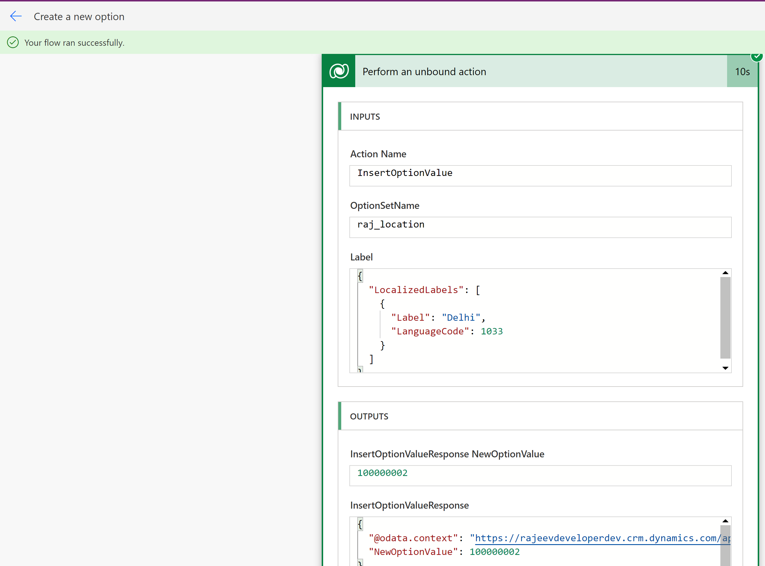
Power Automate | Insert a new option for a global or local option set (Choice) field
In this article, let’s learn how to insert a new option for a global or local option set using the InsertOptionValue unbound action in Power Automate.
Create new option in global choices field:
- I have a global option set (i.e., Choice) field by name ‘Location’

- To add the new option ‘Delhi’ to the option set, use the following properties. Set the label in the following JSON format. Here :
- Label : Optionset label text.
- LanguageCode : 1033 is language code for English.
{
  "LocalizedLabels": [
    {
      "Label": "Delhi",
      "LanguageCode": 1033
    }
  ]
}
- After saving, test the flow. This should create a new option named ‘Delhi’ in the global option set.
Now lets see how to create new option in local choice field.
Create new choice in local choice field:
- I’ve a local option set by name ‘Favorite Sports’ in my table ‘Employee’.

- To insert new option ‘Football’ in the ‘Favorite Sports’ local option set, use following properties. Set the Label in the following json format.

- After saving and testing the flow, a new option named ‘Football’ will be created in the local option set.

That’s it! I hope you’ve learned how to create options in both global and local option sets using Power Automate.
🙂
 Rajeev Pentyala - Microsoft Power Platform